Back in 2016, the once bustling market town of Altrincham, Cheshire was at an all time low. A lot of the town center shops were vacant and the streets and roads were in a state of disrepair. The expansion of the Metrolink that was supposed to bring more visitors to the town, had opened a gateway for criminal activity from the surrounding areas, and so Altrincham fell victim to increased vandalism and crime rates.
Fed up with seeing their town and the local economy suffering, residents and business owners grouped together to form a board, and an application was submitted to the local council for additional funding. This application was a success and Altrincham was granted the status of Business Improvement District (BID) where the council and local businesses collaborate to improve the overall state of the town center, funded by a levy system, topped up with local conucil grants. This status would be valid for a five year period.
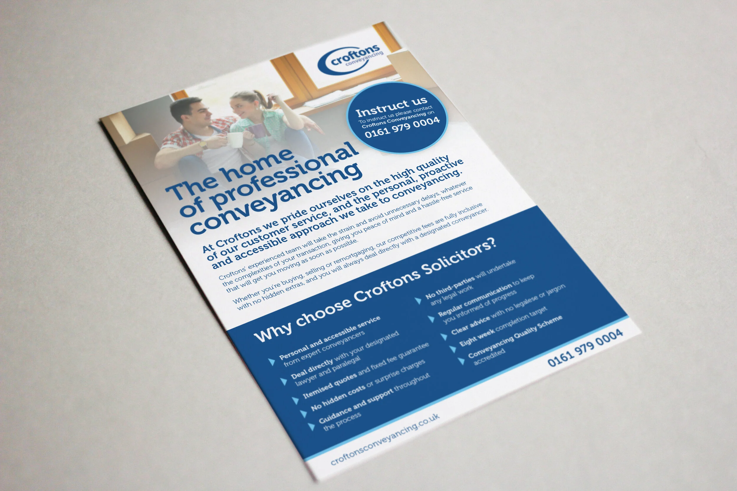
It was at this time that that the BID board approached the agency I work for, as we were based in Altrincham, to come up with a brand identity for the newly formed BID. Of course, we jumped at the opportunity as the recent decline had a negative impact our business too. We immediately got the ball rolling by creating a name for the BID, as we wanted to go further and better than other towns who had also been granted BID statuses and had simply named themselves ‘Somewhere BID’. We wanted to show that Altrincham had potential to be back to being that once thriving market town, to not be limited to just being a shopping high-street, but a place where people will want to shop, work, eat, drink and socialise. And thus, the name Altrincham Unlimited was born.
As a design team of just three, we each came up with our own ideas of how the brand should look and feel, and specifically, what the logo should look like. My design came after hearing a radio advert on my drive home for a well-known brand of batteries that ‘go on and on’ and I clearly remember picturing a line that went right off the page – a line with no end or, an unlimited line. This was my lightbulb moment and I sketched the logo as soon as I got home. A simple wordmark with an overline that extended off the right-hand-side of the page. This was the logo that was chosen above any of the others.
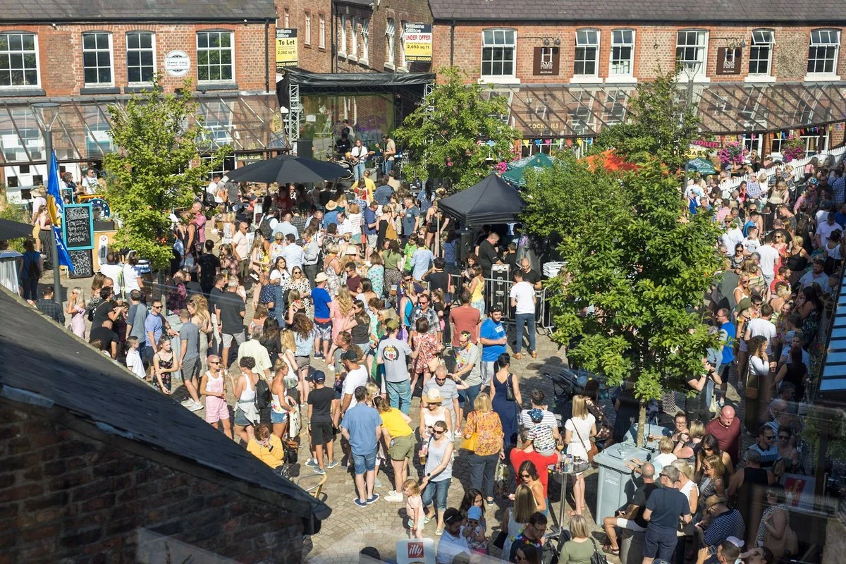
Soon after, I was being asked to produce materials for promotional events in the town such as a music festival as well as fun days and events that were all funded by BID levy-paying businesses. The first Christmas lights switch-on event attracted the highest footfall ever recorded in Altrincham and all other events were also hugely successful.
Altrincham Unlimited had successfully turned the town around and as well as funding events, they have also resurfaced roads and paving and even installed planters and structures turning Altrincham into a bright and colourful place for many independent businesses to set up, and for residents and visitors to enjoy!
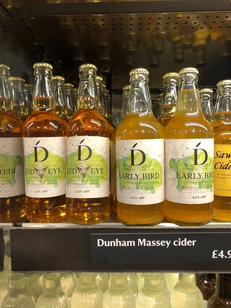
The project began when Dunham Press owners, Chris and Alison approached to increase their hand-pressed cider sales by improving their shelf presence with a new label design. Their brief was clear – they had to look colourful, distinctive and classy, while retaining their proud heritage.
To achieve the message that Dunham Press had been around for generations, I suggested that the background could be an old map, and in a perfect twist of fate, Chris revealed that he had a framed 200 year-old map of the area where the orchards were situated, framed in his families farm home! After some convincing, he brought the map into my studio where it was very carefully removed from its frame and scanned to form a perfect background for the new label designs.
I wanted to give each label a different colours so that each different cider had its own identity, and after some discussion, we decided to use the colours of the types of apples used to make the ciders (with purple for the one with blackcurrants). I ‘borrowed’ my then 6 year-old daughter’s paints and created the watercolour splashes you see on the final labels. These were also scanned and placed on top of the map with a blend opacity to look like the map had been splashed with the colour.
Finally, the Dunham Press logo was simplified and the typographical elements were added. A serif typeface was used to give the classy, sophisticated look and with some small graphic details, the labels were done.
Feedback from Chris and Alison was more than positive, and they had found that the cider had been “flying off the shelves” and that production had to be increased to keep up with the demand – a nice problem to have.
Dunham Press ciders can be found (if you’re quick) in National Trust shops in and around Cheshire.
They say never work with friends or family, but in this case, the whole process was a joy to work on from start to finish!
My friend, Sophie, an NHS nurse and more recently, an RGN registered cosmetic practitioner, had decided to set up her own business in skin treatments and cosmetic surgery.
She had already chosen the name Cheshire Rejuvenation when she asked me if I would design her a logo. Her brief was that she wanted something clean and simple and that she wanted to appeal to the “footballers wives of Cheshire” – her way of saying that she wanted to be seen as an ‘upmarket’ cosmetics brand and not a backstreet clinic.
During the initial discussion, I wanted to get a feel of what other brands Sophie aspired to be like, and the likes of Luis Vitton and Mulberry were very high on her list. I knew this had to look good!
After creating a few different brandmarks, I took some options to Sophie and she immediately and excitedly picked out the only one in my mind. A seemingly simple leaf to portray new growth (or rejuvenation) that was made up of the initials, C & R. I really wanted the initials to be as subtle as possible and for it to be a leaf first, and the initials to be more of a talking talking point. A modern serif typeface was used to appeal to more upper class clients and I chose a fresh green and grey colour palette fitting for a clinical cosmetics brand.
A range of stationary and bags were also created as part of the branding project.
Here are just a few of the videos and animations I’ve created, from personal projects to some client work.
Video production is a passion of mine and I love to tell a story – not just through the timeline of the video, but through colour grading and sound design that fully immerses the viewer and takes them on a journey. Something that many video editors often overlook.
I have several cameras for shooting video including a DSLR, GoPro and a DJI Mini 2 4K drone for those harder to reach angles.
I primarily use Adobe Premiere Pro and Adobe After Effects for all my editing and post production.
Just for fun. Drone footage of Tenby in Pembrokeshire, South Wales. A picturesque seaside fishing village.
Filmed using a DJI Mini 2. Edited and colour graded in Adobe Premiere Pro.
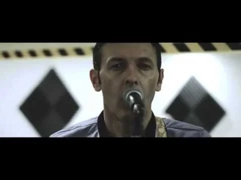
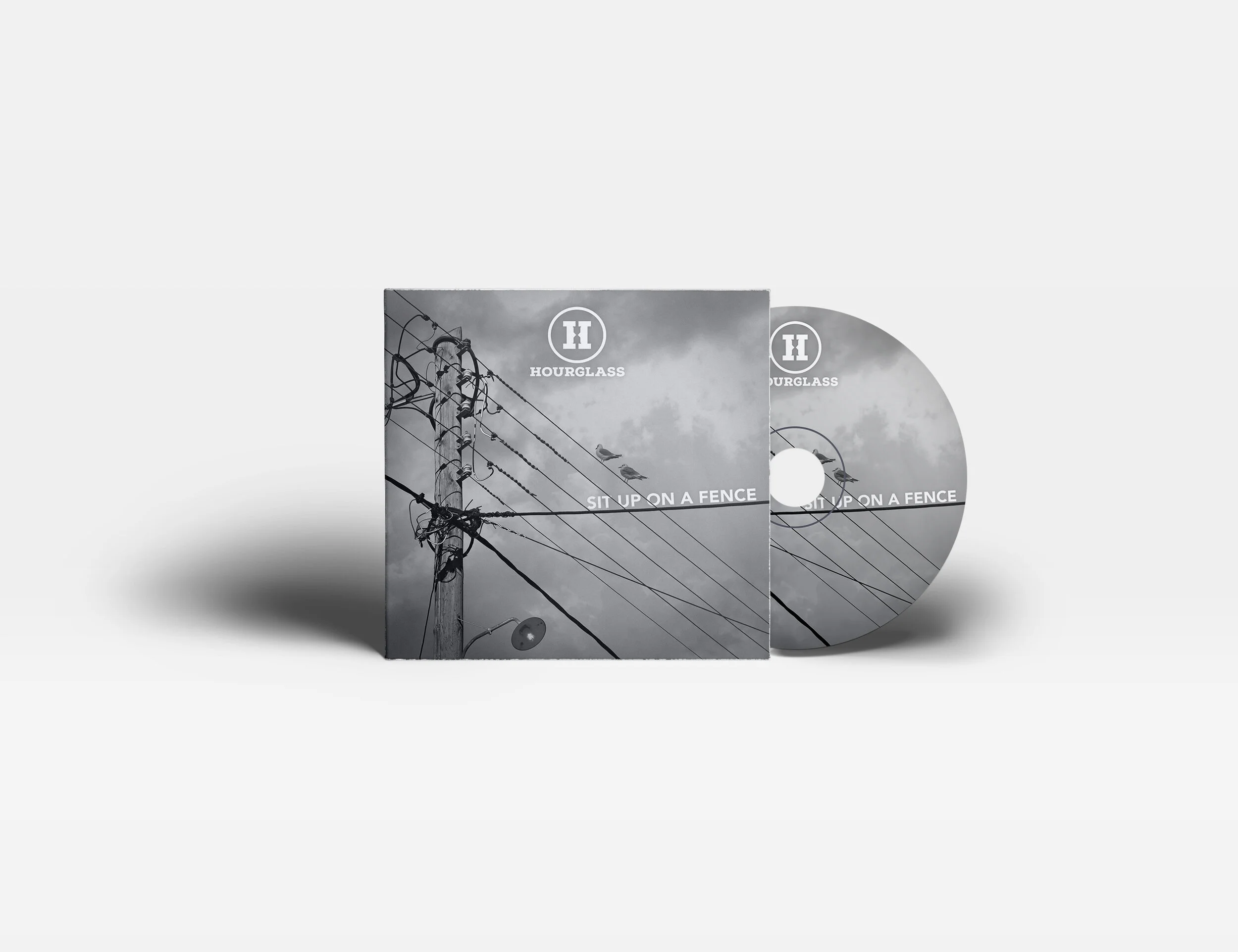
Music video for Hourglass single – ‘Sit Up On A Fence’
Filmed, directed and edited by me. Just me.
Infographic created for global Ship Management Company, V.Group.
Animated for use on social media platforms.
A short animation to show how different elements of branding assets could work together with the logo. This particular client chose to go with a different name (NorthCare Charity) and so this branding was abandoned.